Healthcare Design System
Architected and led the build of a healthcare technology company's design system from zero: a Figma global design system, componentized into a React and TypeScript library and shipped as a private npm package. Now the single source of truth across six products.
- Design System
- 0-to-1
- Design Tokens
- React / Typescript
- Figma
- Claude Design
- Claude Code
- Role
- Architected the system; led design and engineering through build-out and adoption.
- Scope
- Six products, including ones within a Turborepo monorepo
- Outcome
- One robust, heavily tested source of truth across all internal products and clients
- Figma to live adoption in ~4 months; now scaling to a second, larger monorepo
Objectives
My mind is always on optimization of design and front-end code. At a healthcare technology company where I lead design and development, I found myself frustrated over the different instances of the same components scattered across code and Figma files. Each one was copy-pasted with small tweaks or bugfixes sprinkled across each instance. Every bug fix and every per-project enhancement had to be hand-applied in each project.
It worked, but it was a patch on a growing problem: each codebase and Figma file felt heavy to load and maintain, weighed down by the multiple instances of components that could be unified with a bit of lift. As we scaled, the problem became all the more obvious - and as the lead of the design and front-end development teams, I felt the weight from both sides.
It was never just about pruning duplicate components. It was about consolidating brand across design and development at once.
We needed a real standard for our brand: one global system everything else could draw from, without giving up the per-client and per-product customization that our business runs on.
Approach
I led and owned this end to end, from the Figma system to the production architecture. A designer and an engineer helped build it out; I set the direction and held the bar through regular design and dev reviews and facilitating adoption of these new systems.
01
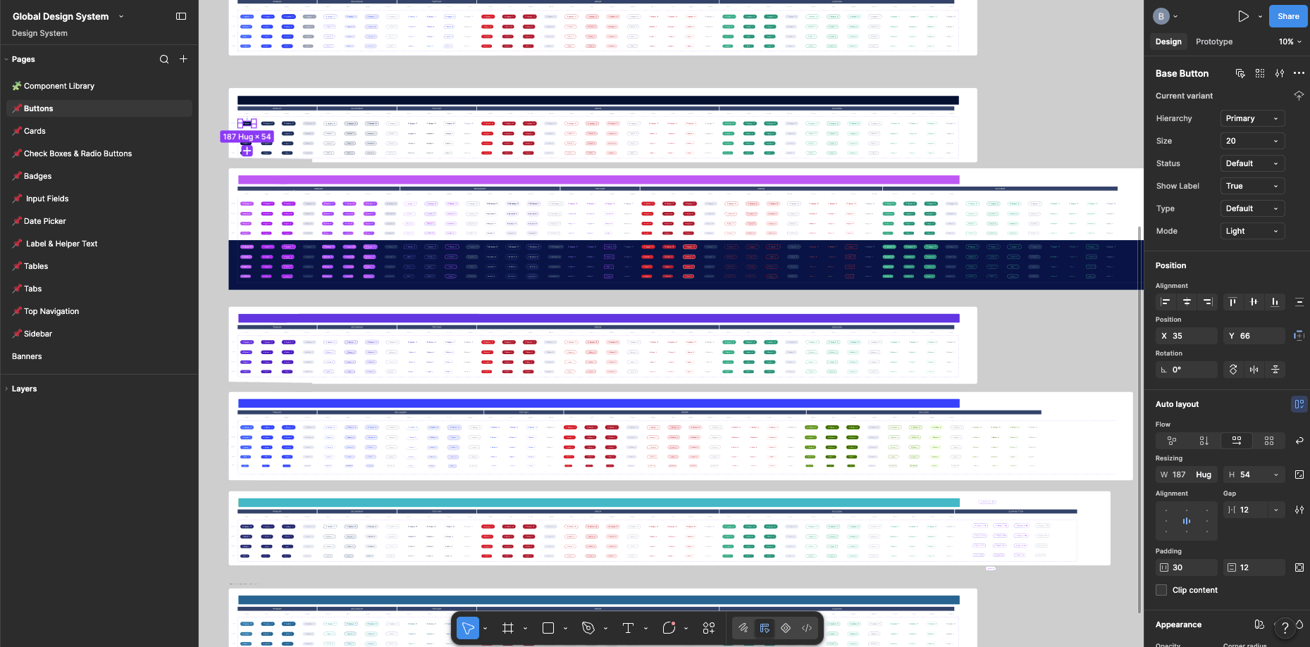
A Figma global design system as the single source of design truth.
We created product color schemes, typography, and components as Figma variables and design tokens. Then, we subsequently published them as a library that design files adopted. The Global Design System file became the one-stop shop for every brand asset and component, stopping copy-paste rebuilds and unlocking a trusted, tested source of truth.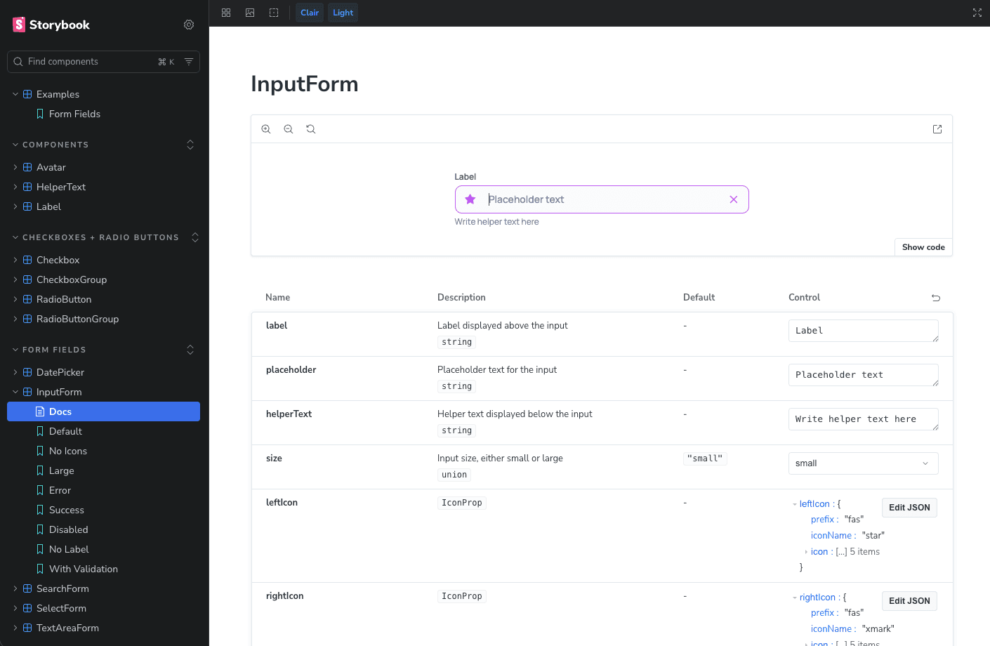
02
Componentized into a code library, shipped as a private npm package.
Rather than hosting a set of copy-pasted components between projects, our component library ships as a set of pre-tested React/TypeScript components styled with Tailwind CSS and SCSS and measured for excellence. We packaged it as a private npm library and injected into each project's package.json. All components are easily reviewable via Storybook.03
Per-client branding on a shared base, without forking.
Our components stay brand-agnostic. Each product carries a small SCSS color file that themes the shared components in its own palette — a little brand-specific color layered on top of one common foundation. It’s the best of both worlds: clients get a custom look, and we keep one clean codebase.04
Consolidated into a Turborepo monorepo.
I moved a handful of codebases into a Turborepo monorepo, collapsing duplicated code into reusable, pre-tested, shared slices (which include components, config files, API calls, or even entire pages). Because they're already built and tested, projects consume them as-is. With the addition of the component library, we can be sure that new work starts from a solid base.05
AI woven through the workflow, managed by robust visual guidelines.
On the dev side, a well-built component library is the perfect thing to keep code honest. Theme files are generated by an AI skill in moments, and once a single app is standing in the monorepo, a skill document scaffolds similar client projects from it. Since the components come from the npm library, we have more confidence in the output.
On the design side, we have a multi-spoked wheel. Figma AI and Figma's Claude MCP ingest the design system readily, accelerating design output. On top of that, we've plugged the design system into Claude Design to stand up branded prototypes in minutes. This is not only great for dev handoff, but also for internal demos, proofs of concept, and ideation.
On both sides: our robust brand is what makes speed safe.
06
Drove adoption deliberately.
A system only matters if the team actually uses it. We demoed the library from a live, internal Storybook link over a lunch-and-learn to put it on everyone's radar. We then simply started standing up new client work on it, because it was as easy as the old copy-paste and without the debt. Adoption happened because we built the component library in a way that made using it the simpler path.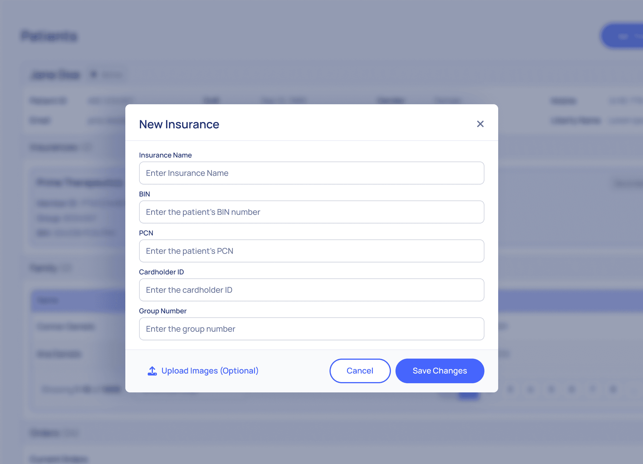
Outcomes
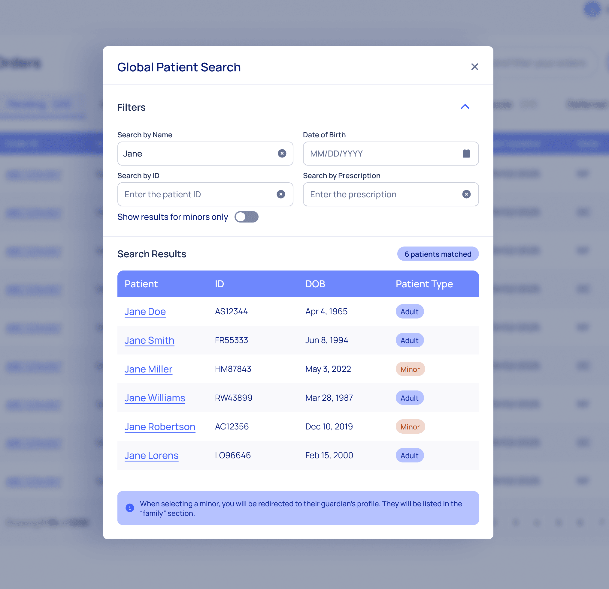
The duplicated components that once lived across multiple repos and Figma files now live in one themed, shared library. Bug fixes and enhancements on the dev side propagate from the npm package rather than being hand-applied repo by repo. New internal and client products start from the shared base with an AI supercharge to accelerate output. And most importantly, design and engineering finally pull from the same source of truth.
Today the system backs five client-branded products and a high-visibility internal platform in one monorepo. It's now being rolled out to a second, larger monorepo of roughly ten client projects plus another internal product.
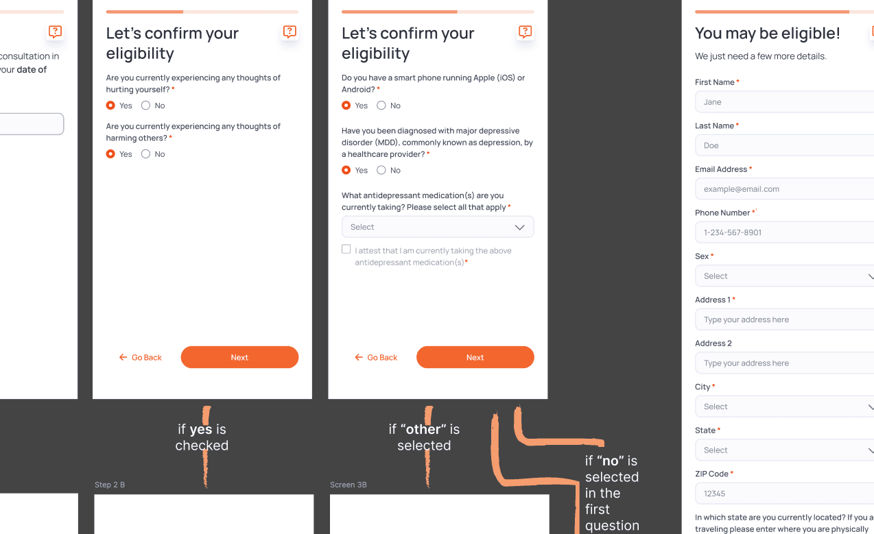
From the first Figma file to live adoption took about four months — design in January to February, development through April, rollout across April and May.
Owning both ends of design and development cut down on the cost of maintenance and increased speed. The Figma library and npm package speak the same language because I maintained both.