Clair Search Results Revamp
Product DesignFront-End DevelopmentStrategyReactFigma
Orchestrated, designed, and developed end-to-end revamp of Clair's clinical search interface, focusing on signup incentive and optimizing loading states, resulting in 34% increase in free plan signups and 10% decrease in drop off.
The Problem
- Major Layout Shift: Our API doesn’t come back with a search result immediately—as to be expected! Within our original design, though, we didn’t capture well enough the different UI states that come with multiple levels of loading.
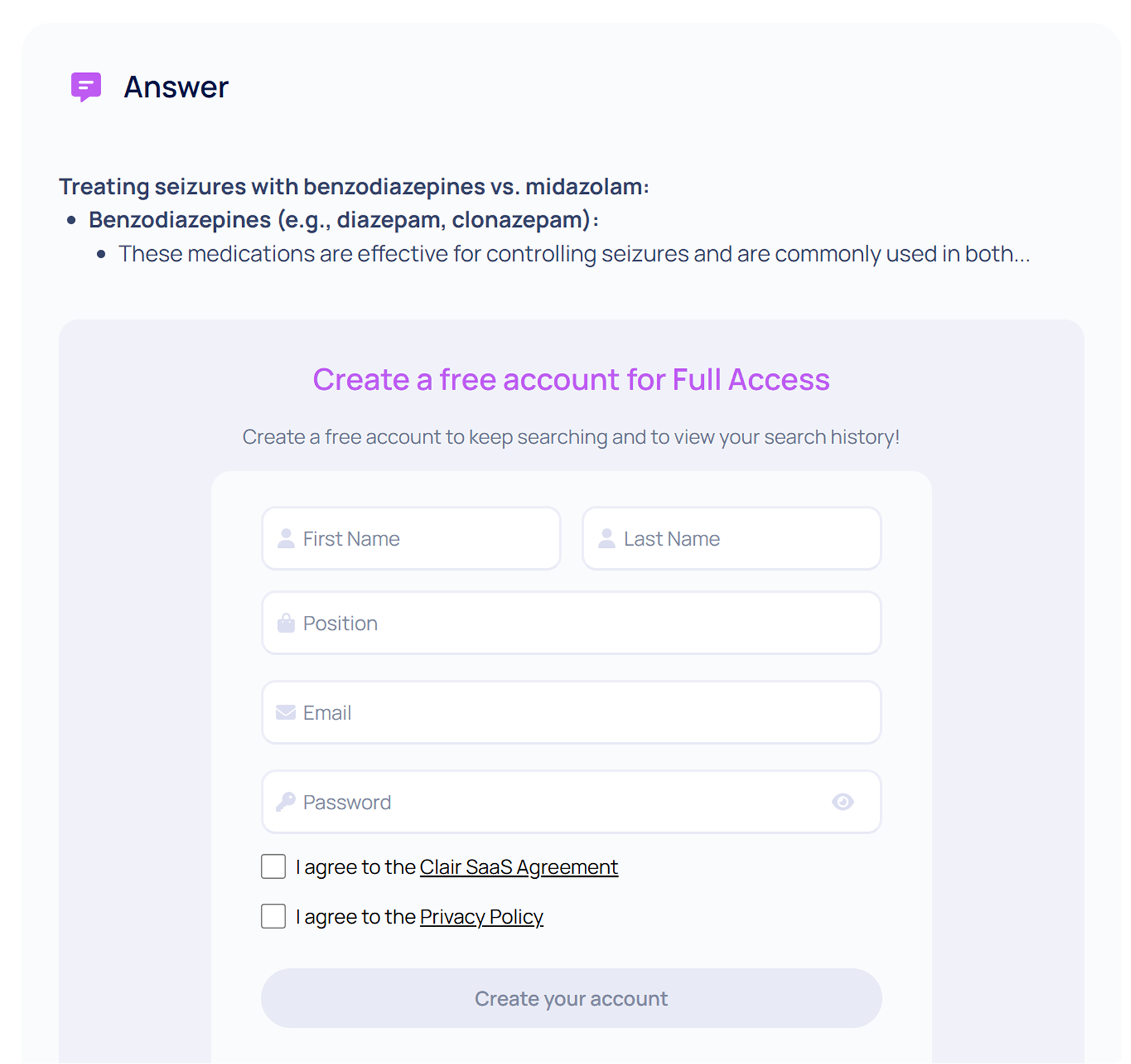
- A Lack of Signup Incentive: To drive outcomes, we needed to add more free-tier perks as well as market them to unauthenticated users.
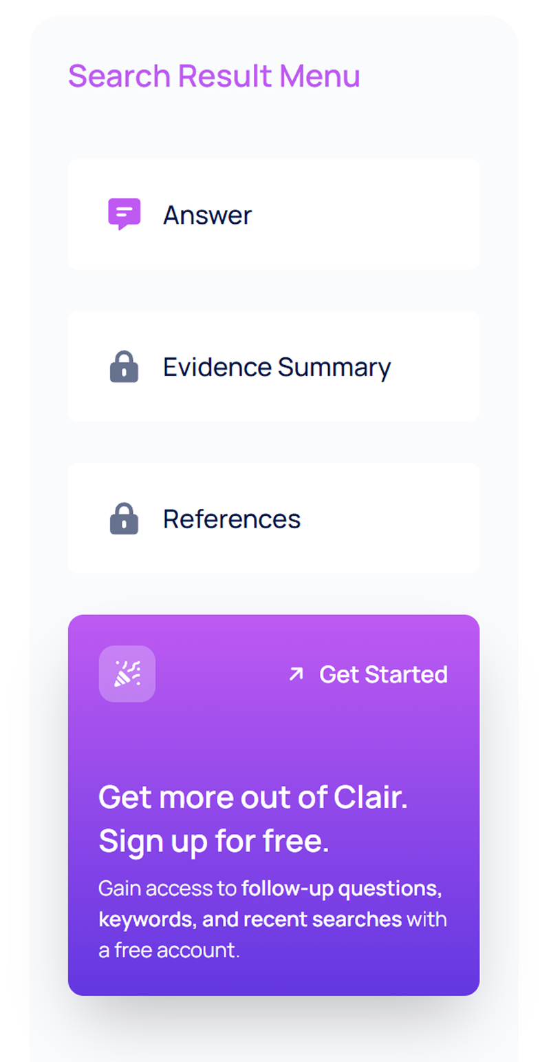
- Vertical & Horizontal Exhaustion: There are two things a user hates: having to scroll too much and having to read across a large horizontal space such as a desktop screen. Unfortunately, both of these issues were prevalent in our original design.
 Our old search results experience. Notice the long lines of text that users would have to read across large screens. Loading was also a disjointed experience-sections would pop into existence without any indication.
Approach
 Our main objective here was to pick some low-hanging fruit: efforts that would be easy to implement with a sizeable user impact. With our long-standing objective of keeping Clair user-friendly for both professionals and non-professionals, we focused on efforts that would benefit both of these user groups. After a conversation with leadership, we picked two efforts from the bunch:
- Tooltip Keywords: When authenticated users search, the result will populate highlighted words that, when hovered over, provide tooltips with definitions.
- This way, users can exit their Google tab and stay on Clair for any necessary definitions!
- Follow-Up Questions: When authenticated users search, a few follow-up questions appear that add depth to the user’s search. Upon clicking one of these follow-up questions, a new tab will populate its search result.
- Both professionals and non-professionals can utilize this feature to dig deep into a topic. This is helpful when the user isn’t 100% sure what to search for when they query Clair.
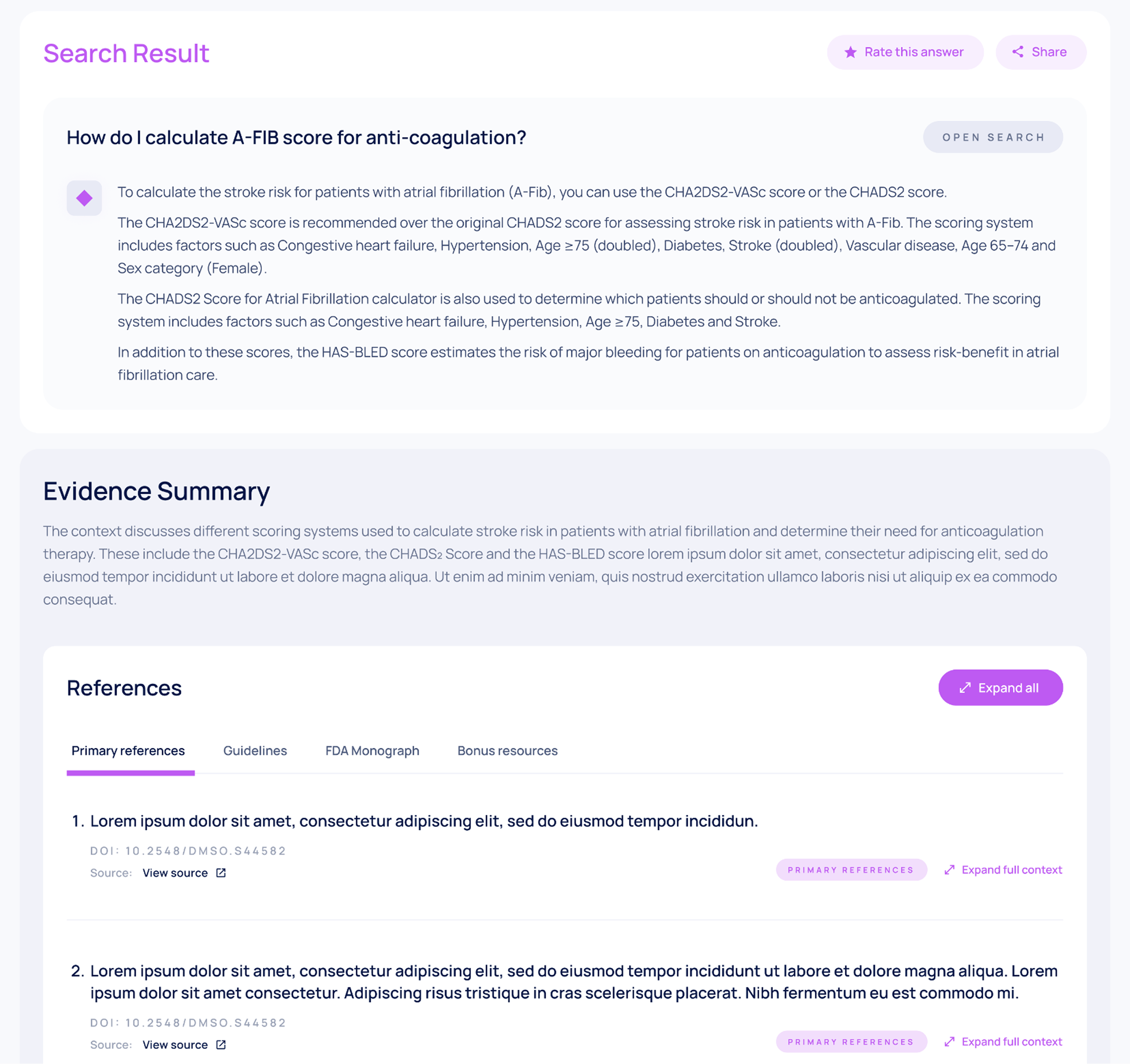
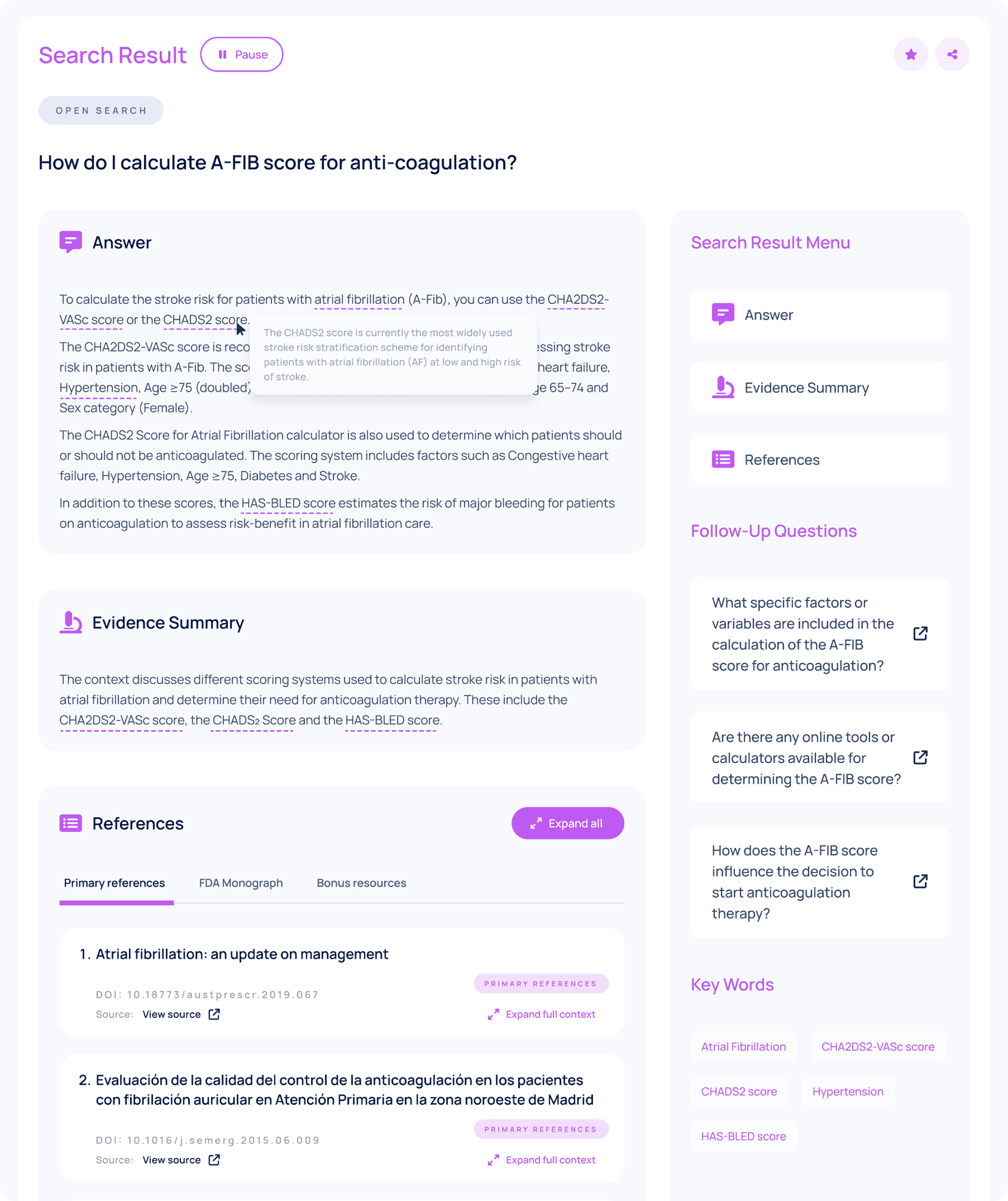 Our designer’s amazing UI (Solution to #3, “Vertical & Horizontal Exhaustion”) with my follow-up questions and tooltip keyword initiatives added to the mix.The Problem “Vertical & Horizontal Exhaustion” was a tricky one. In order to decrease on horizontal reading fatigue, more vertical space would be needed. Our solution was to add a functional sidebar with a menu to the right side of the screen. When the user clicks on a button from this menu, they are automatically scrolled down to the corresponding section; this not only shows the user that these sections exist, but also gives them a quick navigation tool to use.Above, you can also see the Tooltip Keywords and Follow-Up questions in action!