CaryHealth Brand Identity
Led design and development of CaryHealth's brand from the ground up: the brand site, product logos, and company-wide marketing collateral.
- Brand Strategy
- Creative Direction
- Brand Identity
- 0-to-1
- Design Leadership
- Role
- Initiated the brand, hired the team, and directed every deliverable from strategy through the shipped brand site.
- Scope
- Logos, guidelines, brand site, and all sales and marketing collateral
- Outcome
- One market presence across products, sales, and marketing
- Company-wide guidelines every team designs and develops against
(Want a sneak peek of the final brand site? I get it! You can check it out here — visit the CaryHealth brand site (opens in a new tab) )
A central goal for CaryHealth's 2025 year could be summed up by one word: sales.
In late 2024, we found ourselves in a spot where our products were looking and feeling great, but our brand presence was heavily lacking.
Noticing this, we decided to pull together an in-house marketing team to focus on how to best market our products.
I helped vet the marketing designer and Webflow developer we brought on, screening for user-experience fit. Before we'd hired a marketing manager to lead the team, I stepped in to direct the brand work myself -- adjacent to my core craft, but exactly the kind of ambiguous, no-owner problem I like to take on.
The Problem
Our problem was this: Though we already had a brand site, it was lacking in some crucial aspects. The site leaned heavily on 2024-era AI imagery, which failed to showcase the nuances and use cases of our products as well as we wanted. Even beyond the imagery, the look and feel of the site didn't fit our desired brand direction: it felt cold, rigid, and unwelcoming. It was as if we were showcasing a shell of a site rather than a company with innovative healthcare solutions.
Objectives
As a result of these problems, we set aside our main objectives for the three months we had before 2025:
01
A Brand Identity
First and foremost, we needed to tack down a distinctive way for us to present ourselves.
Are we happy? Serious? Playful?
Is our brand loud and colorful, or thoughtful and deliberate? Once we found our footing here, the transition into #2 and #3 would be seamless.
02
A Brand Site Facelift
Without a clear identity, we found our current site to be a mix of text and imagery that didn't fit the bill.
Once we found our brand's niche, we needed to upgrade the site to reflect the colors, descriptive words, and feeling of those newfound brand guidelines. (See below for a sneak peek of "before" and "after" photos!)
03
A Shiny Logo Suite
There are currently five products the company has built out so far, some of which had mismatching logos and others with no logos at all.
Our goal was to align our products in such a way that followed our brand guidelines while allowing each of them a bit of breathing room to showcase their own unique flare. This was the finishing piece of the suite.
With these three objectives in mind and only three months to accomplish such tasks, we wasted no time in finding the right approach.
The Approach
Our marketing designer and I approached our brand identity issue first with an abundance of research. In order to find the fastest route to success, we searched through Dribbble and Webflow's templates section to compile a mood board that seamlessly combined the identities of all of our products into one space.
We ended up finding a few descriptive words that fit our current suite of products well:
Using these three words, we designed a proof of concept — the main hero section of the homepage — to see if the direction held up.
At the same time, we took our three keywords and played with a few ideas for our logo suite. We settled upon a logo for our first product, Clair, and it was a hit! The suite fell into place seamlessly afterward -- each of our products has a distinctive look, feel, and use case to them, so we inherently had all we needed to be successful.
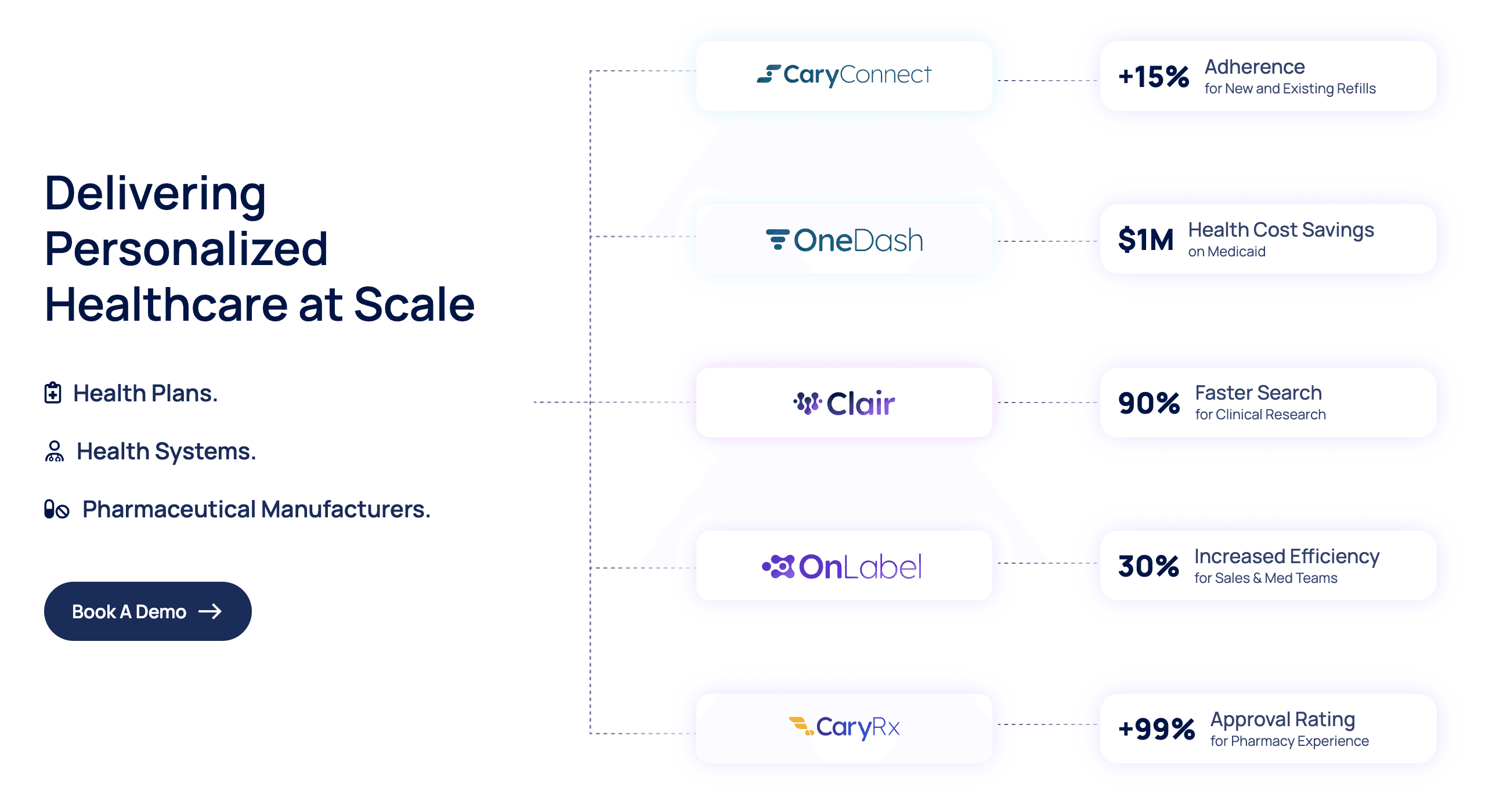 Our first iteration of a homepage hero with our new logo suite in place.
After a few tweaks, we decided to shift this first hero design down the page in favor of a less eye-intensive graphic flow.
Though this was the case, we did find ourselves successful in another aspect: the techy feel of the flowchart-esque design in tandem with the rounded corners and distinctive colors of our products peeking through gave us an idea of how "playful", "clean", and "technical" could work together amicably.
This was our way forward!
For the first iteration of our new brand site, we decided to focus the most attention on our homepage and product pages. The most time and effort went into each of these pages, and rightfully so. It was a challenging, fun task to tie together each of our products' distinctive looks and feels in a way that didn't feel disjointed with the rest of the site.
We shipped the first version of the new brand site that January.
Outcomes
Our brand identity exercise opened up doors for us that previously seemed impossible to crack. With the creation of our logo suite and brand site revamp, we have the context we need to showcase our products the way they deserve to be shown.

Our logo suite combines the unity we so desired from our brand identity with the unique feel that each of our products harnesses. We were lucky in that each product has its own unique color scheme; this allowed us to utilize these colors to reinforce the "playful" theme.
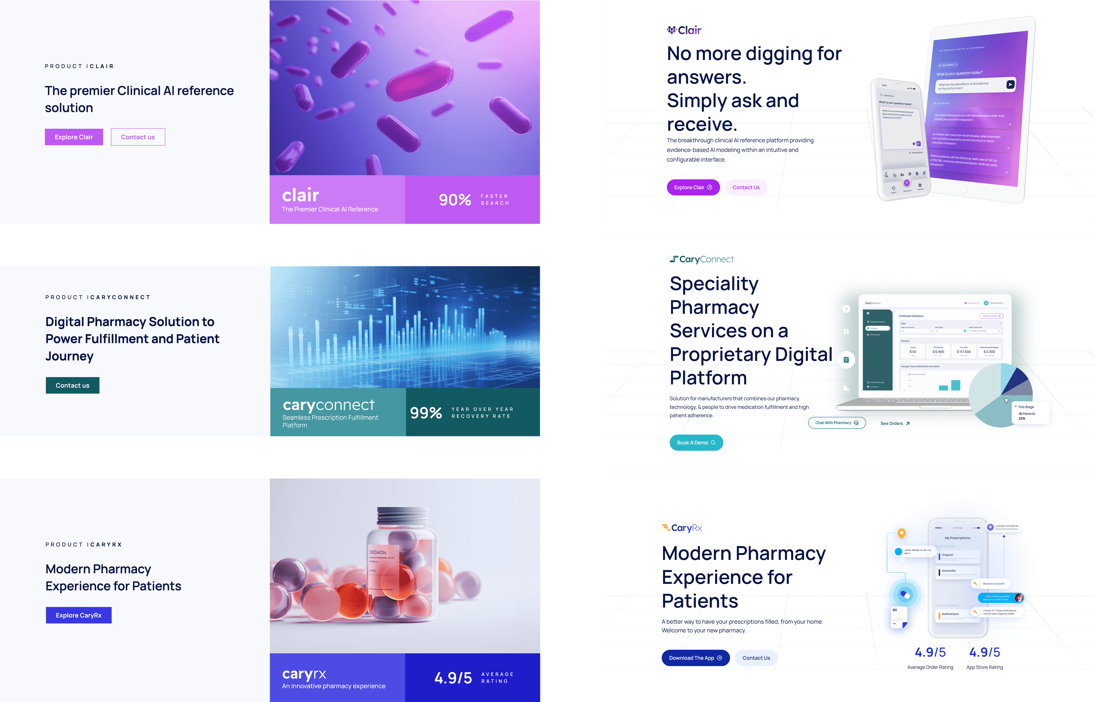
On the left, not much can be gathered from the generic imagery used other than the fact that the user is looking at a healthcare company's website. The names of the products are also drowned out among all of the other text on the page. On the right, though, especially on our product pages, you get a small taste of what we're about.
Within a few months since launch, we've really been able to run with our brand identity. We've created sales decks for our products, one-pagers, social media graphics, trade show backdrops, and even merch! This was all because we set ourselves up for success early, building a solid foundation before jumping to conclusions that wouldn't fit our brand.
Bringing five very different products under one identity was the part I enjoyed most. How a company presents itself can make or break not just how it's seen, but how it sells.
The rebrand landed!
We heard unprompted compliments on the new brand and site from people we met at conferences, and the identity finally gave sales the materials it had been missing -- decks, one-pagers, trade-show backdrops, social graphics, even merch.Brand, it turned out, was product work, not decoration. I thoroughly enjoyed this exercise in bringing five very different products together to form one brand identity.
And of course, the grand reveal! You can check out CaryHealth's brand site here — visit the CaryHealth brand site (opens in a new tab)!